Charlotte’s Web
Rebrand & Packaging
Client: Charlotte’s Web
Services: Brand Identity, Packaging Strategy, Packaging Design, Production Design
Photos: Charlotte’s Web
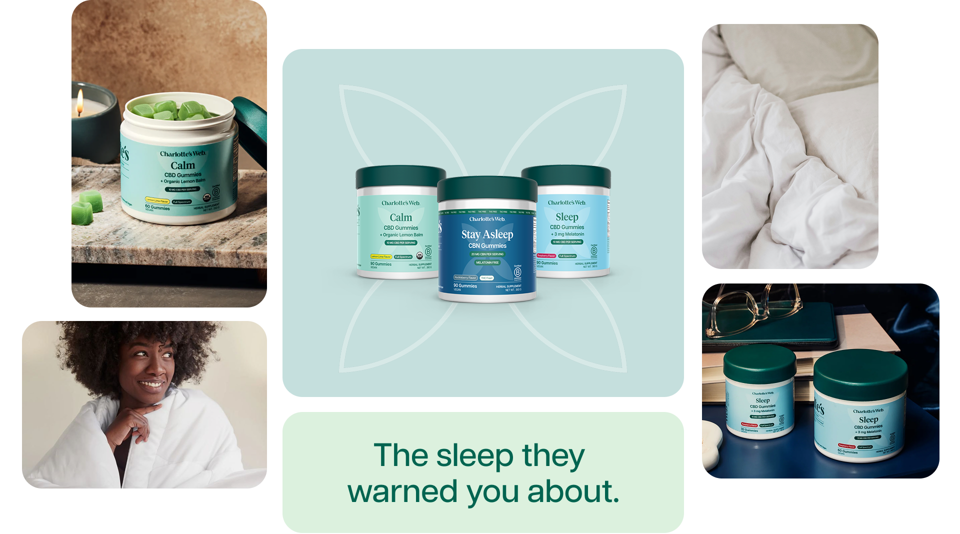
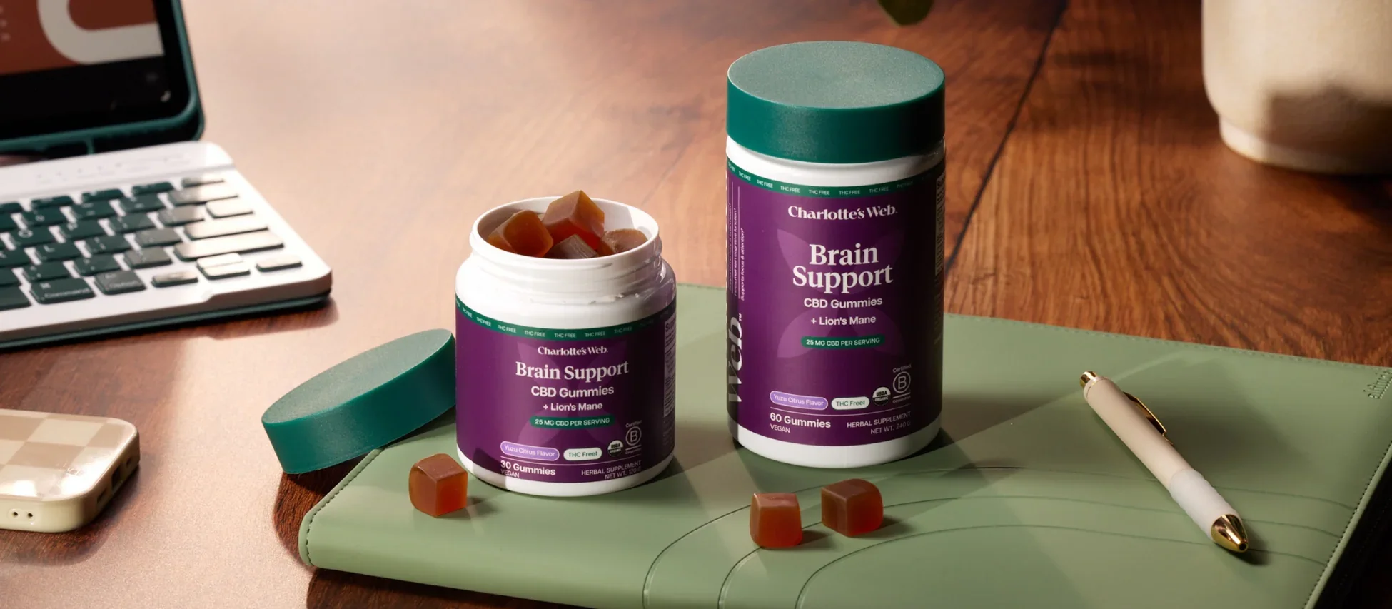
Charlotte's Web came to Saku Studio with years of customer data, a loyal audience, and an ambition to grow beyond their roots. Our work was to reimagine the full packaging system for where CW is headed over the next 5–10 years: a brand built for everyone, scalable across every retail environment.
We started by dismantling the previous packaging system making room for a broader identity, one that could speak as clearly on a Target shelf as it does in a specialty wellness boutique or on a Walmart endcap. The new system needed to flex. From there, we built the design system from the ground up — establishing color, typography, and hierarchy as the three pillars holding everything together.
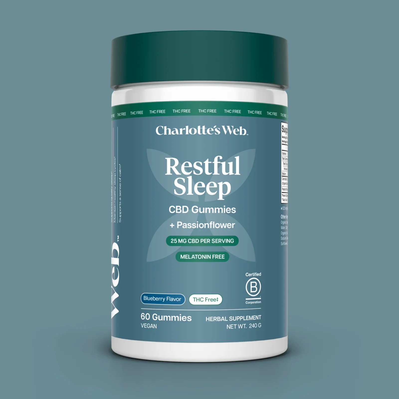
Humans are instinctively drawn to nature for healing, balance, and renewal. This is a response deeply rooted in our biology. Natural hues reduce stress, promote calmness, and restore focus.
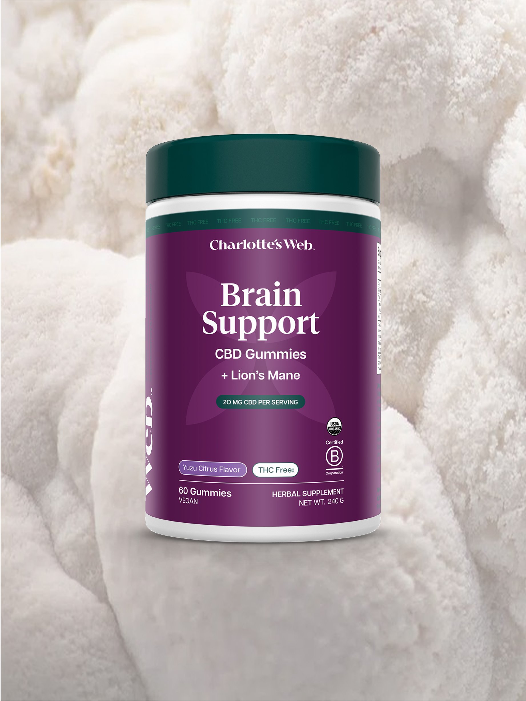
By using carefully chosen nature-inspired hues with that touch of vibrancy for the packaging, the brand reinforces the clean ingredients within the product while creating an instant emotional connection with consumers that alludes to each need state.

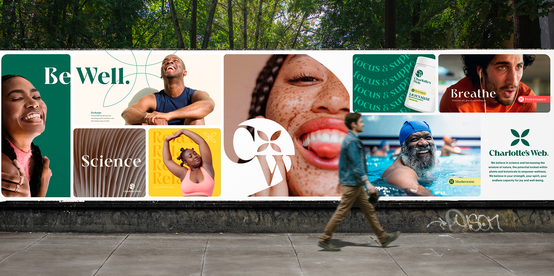
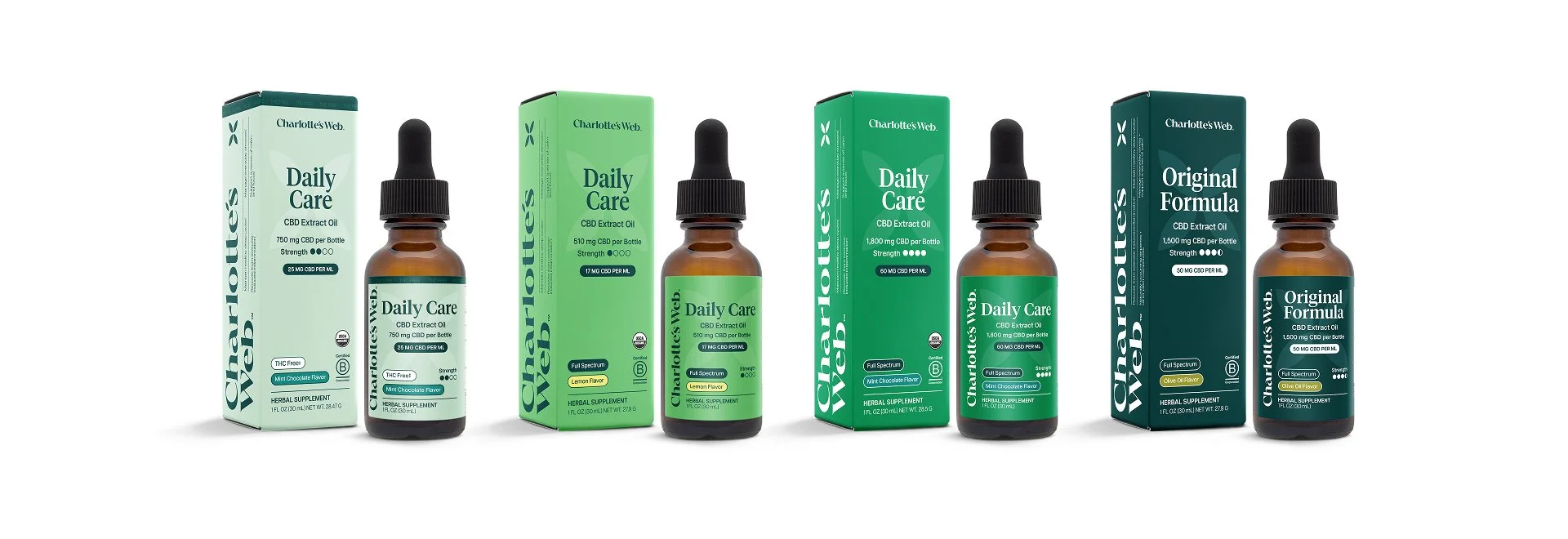
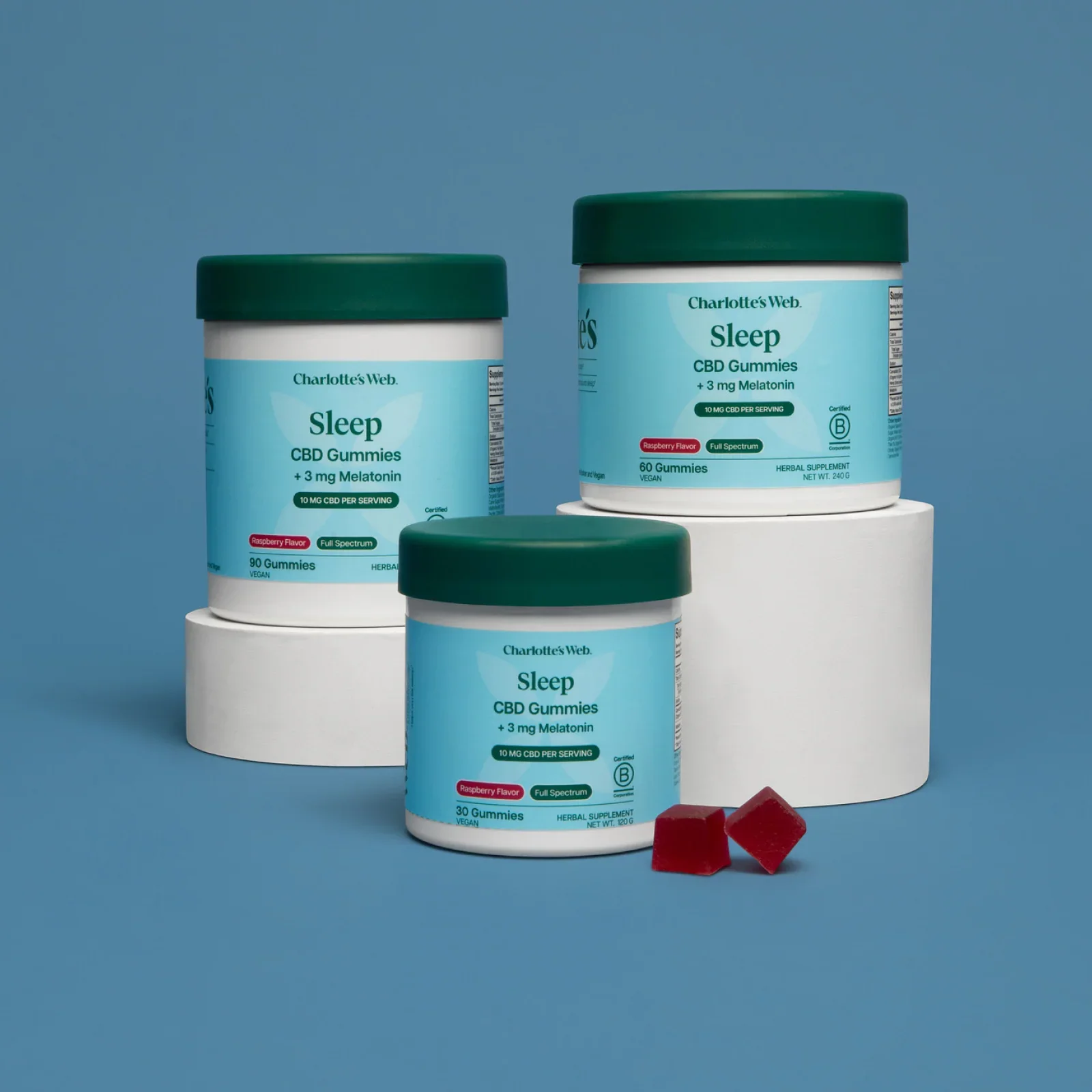
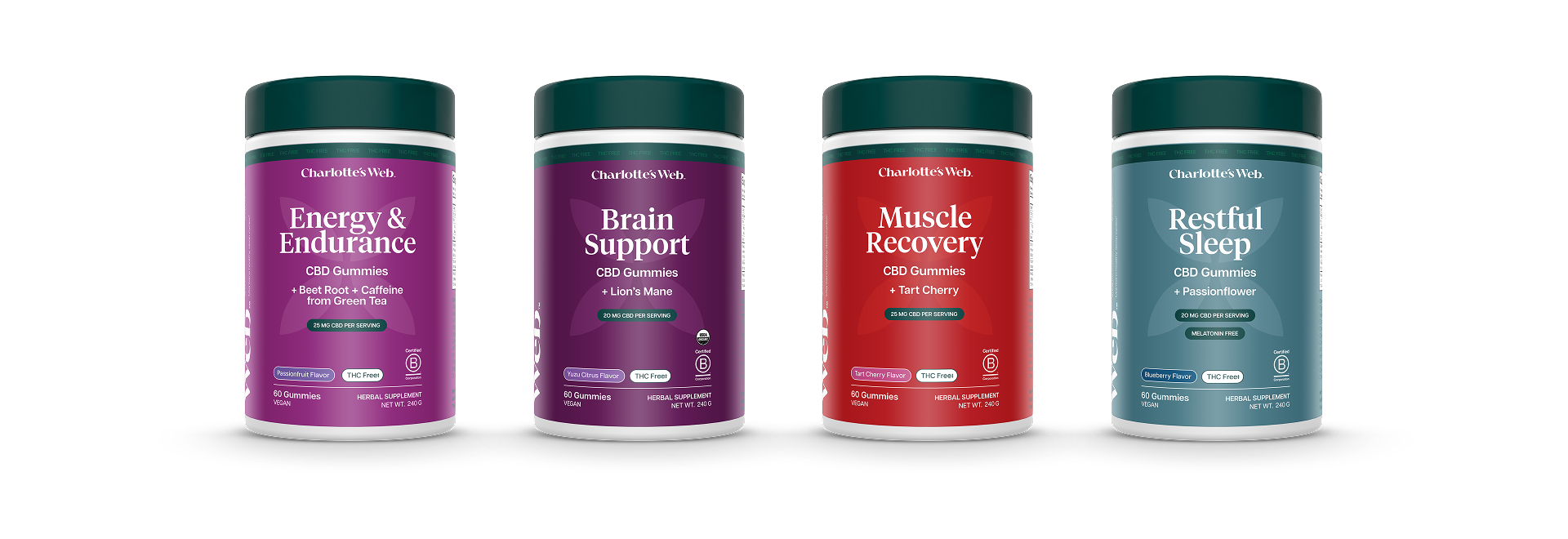
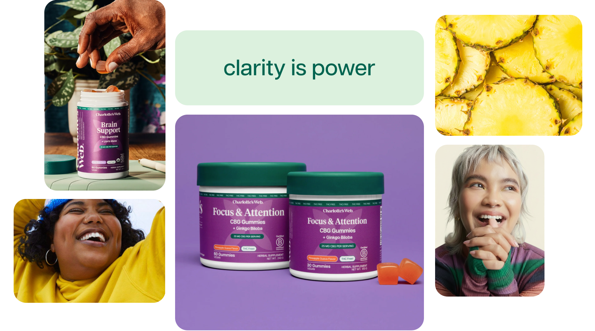
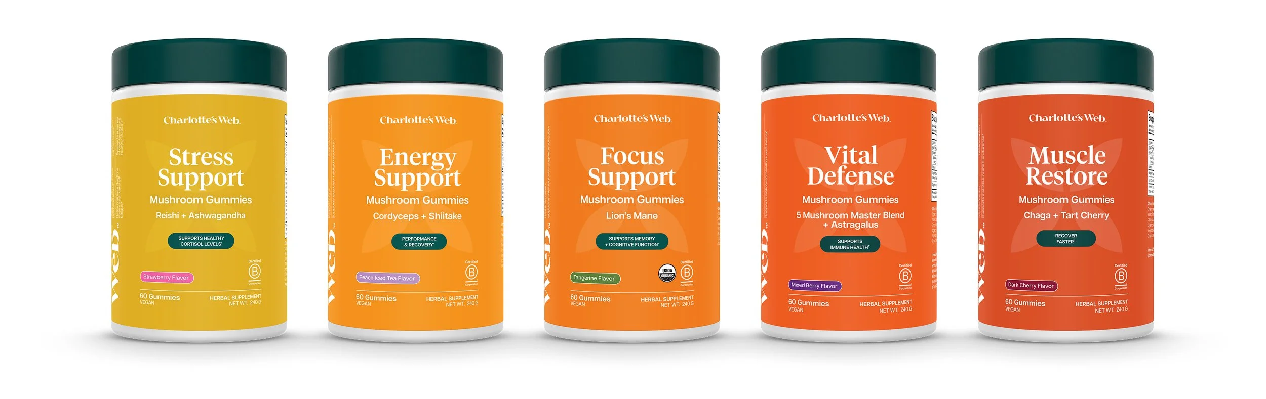
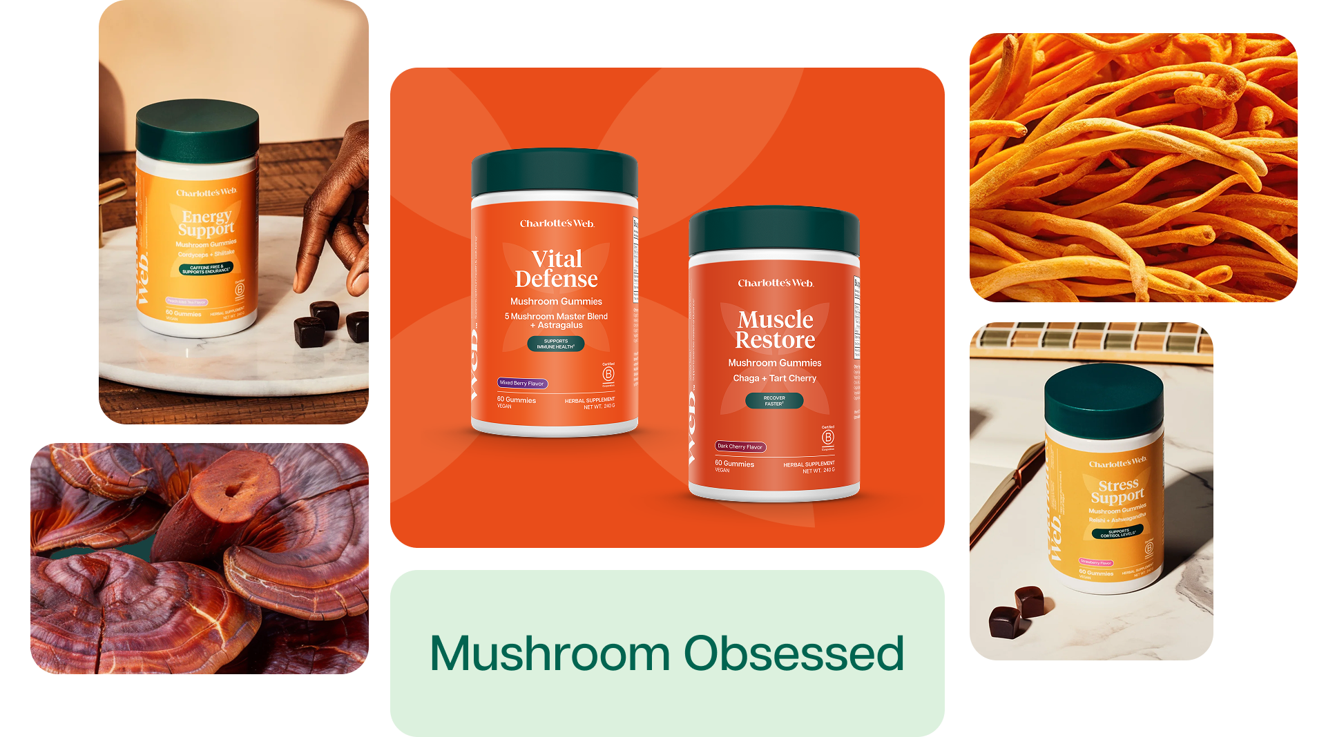
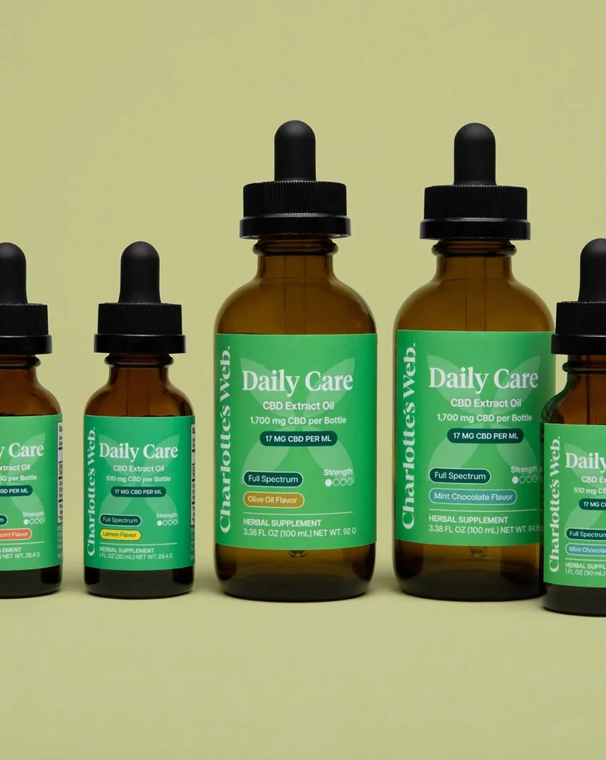
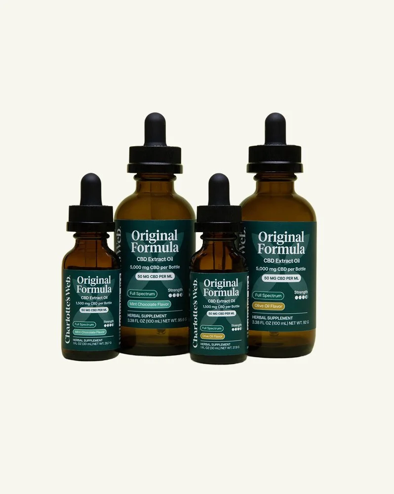
Using color theory and hierarchy to guide shoppers through the product line
Color became the primary navigation language, drawn from each product's core ingredients and intended effects, allowing shoppers to move intuitively across the line.Typography was selected to carry both credibility and approachability, balancing the clinical trust wellness consumers expect with the warmth the CW brand has always held. Hierarchy did the structural work — creating a clear visual order that communicates the right information at the right moment, whether someone is scrolling a product page or scanning a shelf from ten feet away.
Abnormally Good Botanicals
Nature and science are our ying and yang. We’re unwavering in our commitment to find the best stuff earth has to offer. And we find the big brains — the PhDs, scientists, herbalists, flavorologists, and engineers — that know exactly what do to with it.
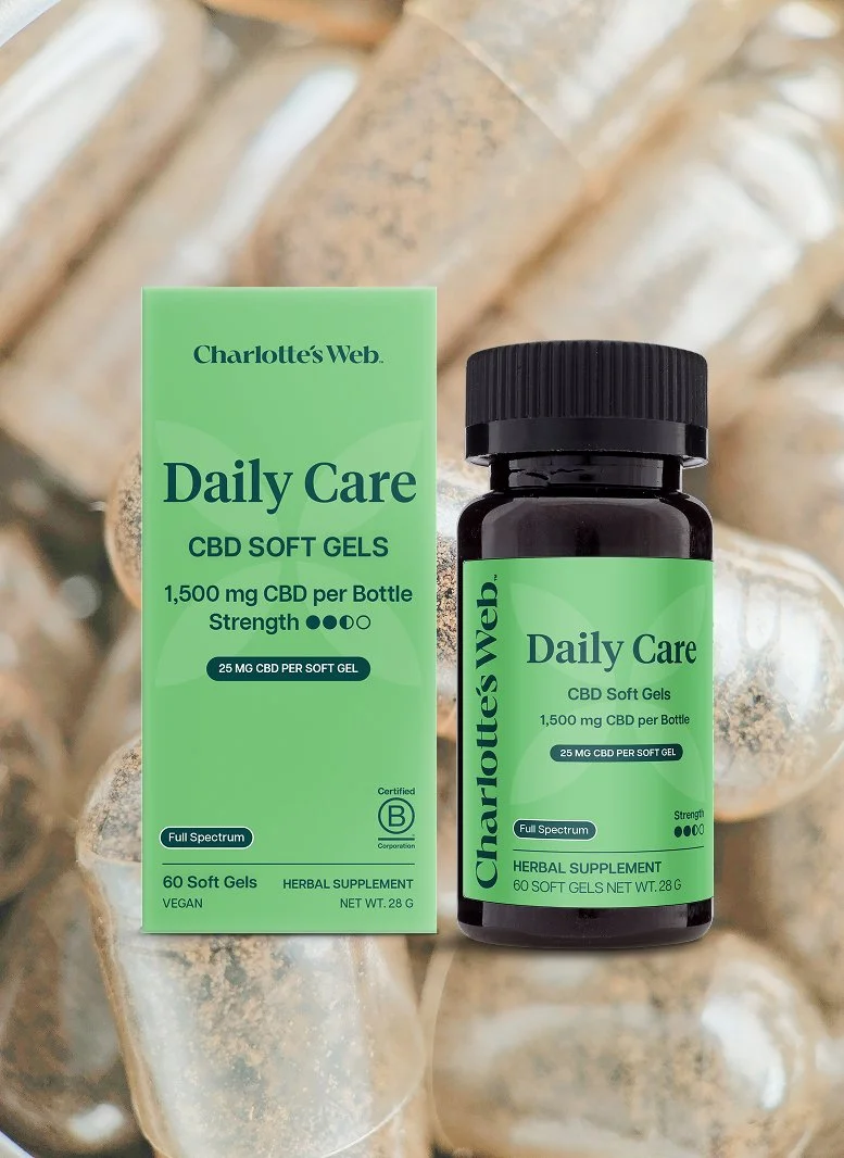
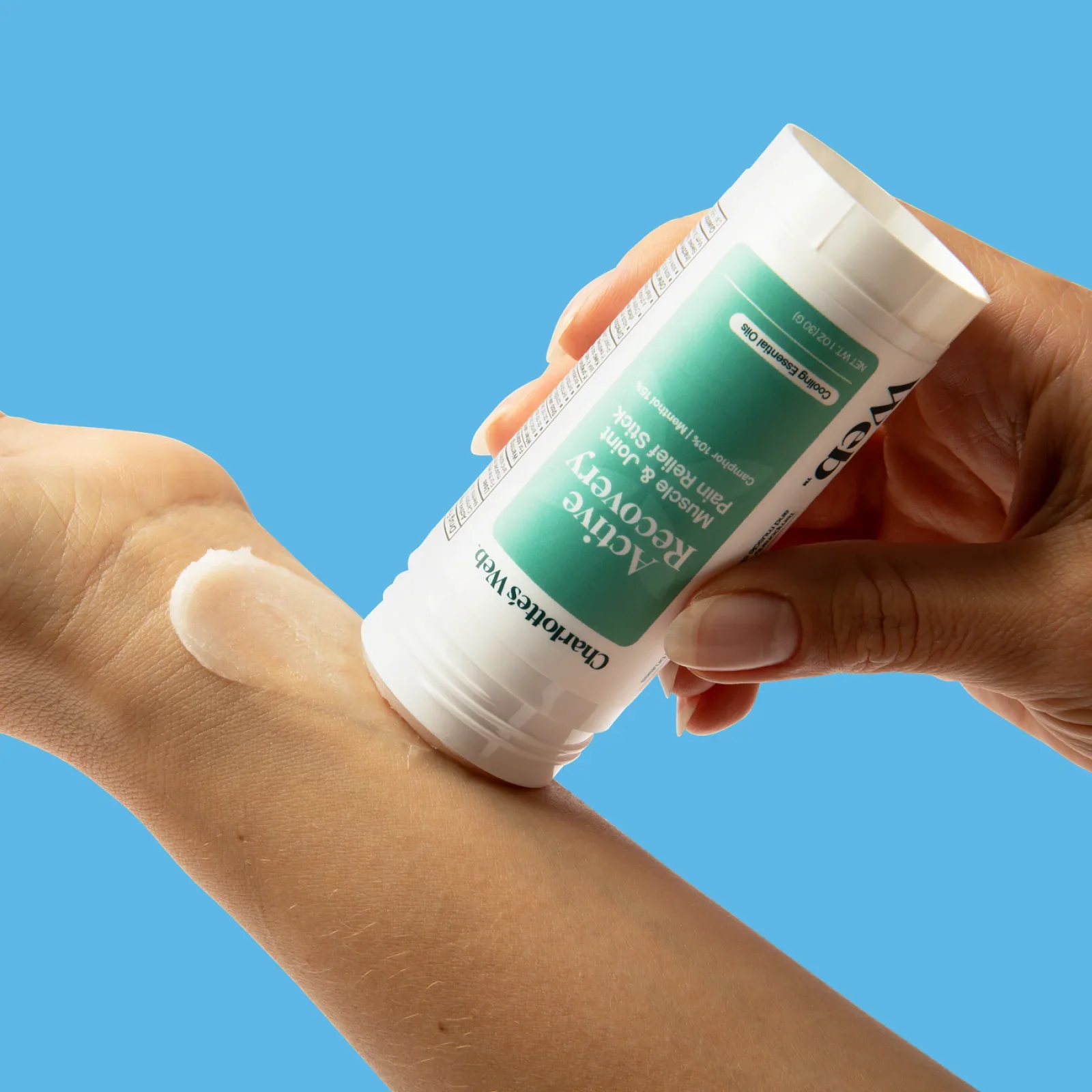
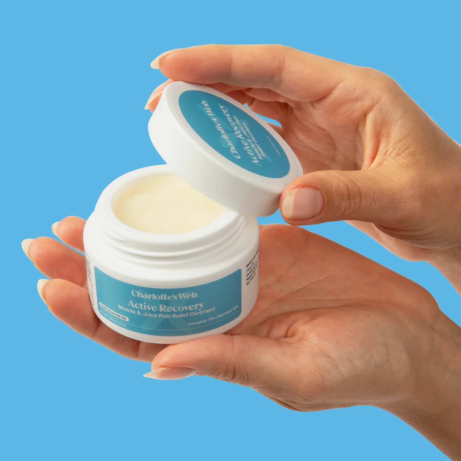
Designing a system that flexes across product forms
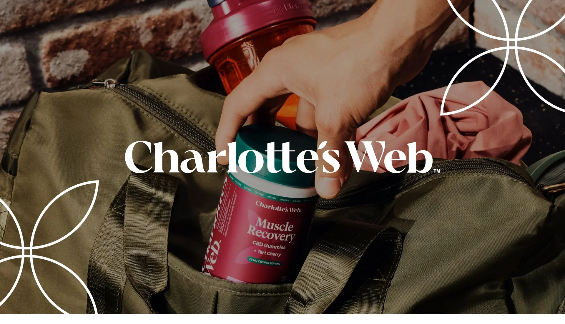
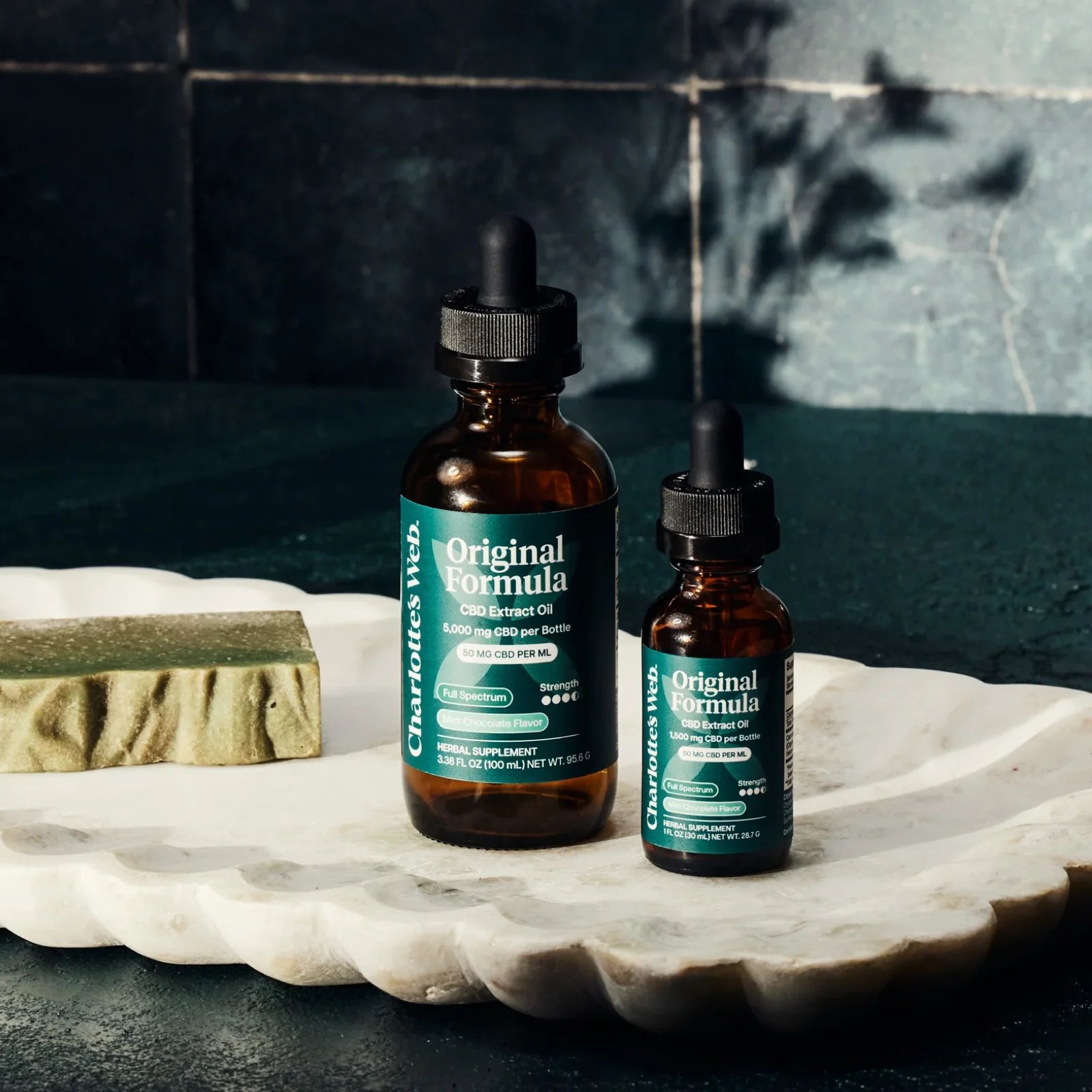
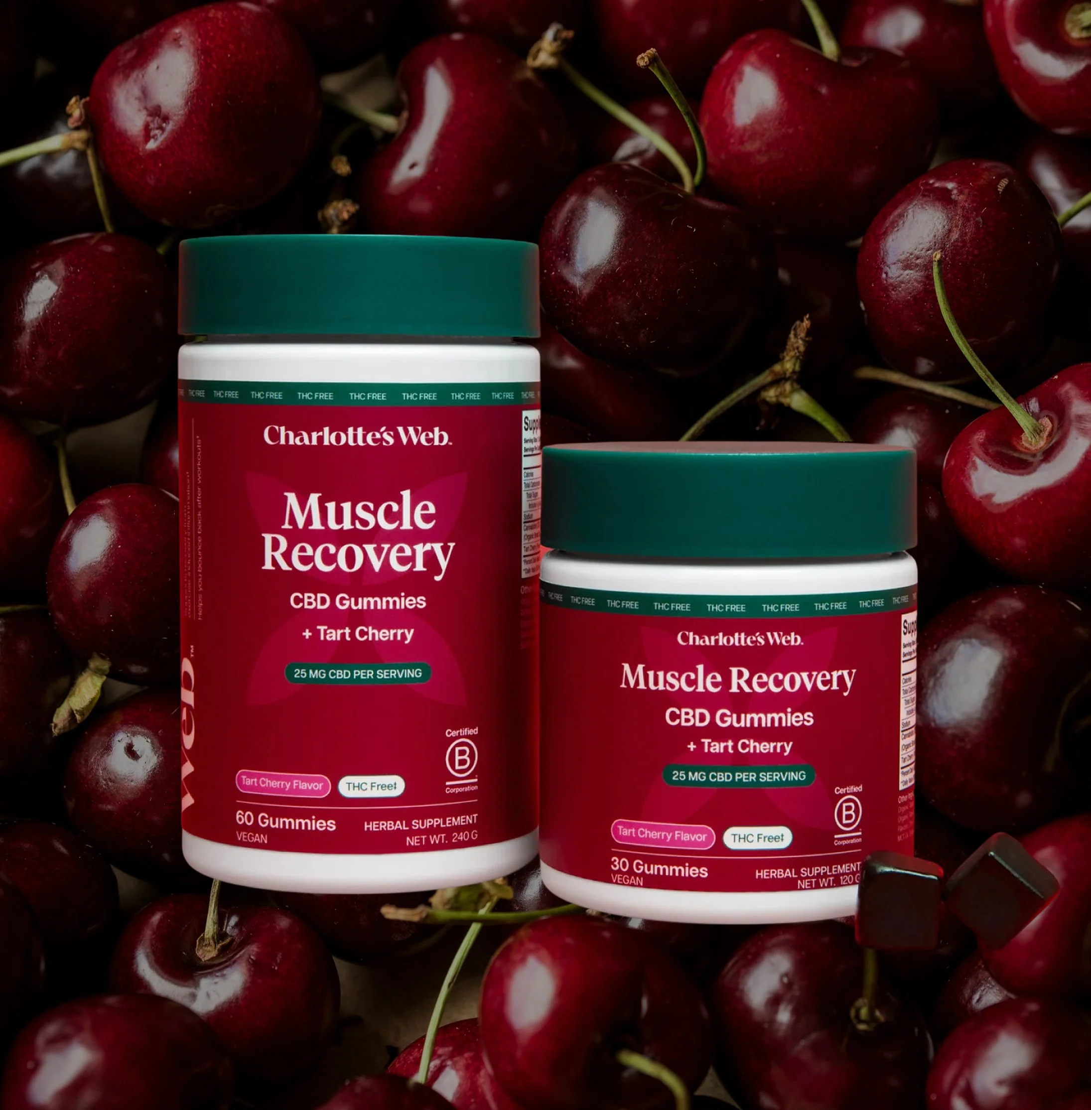
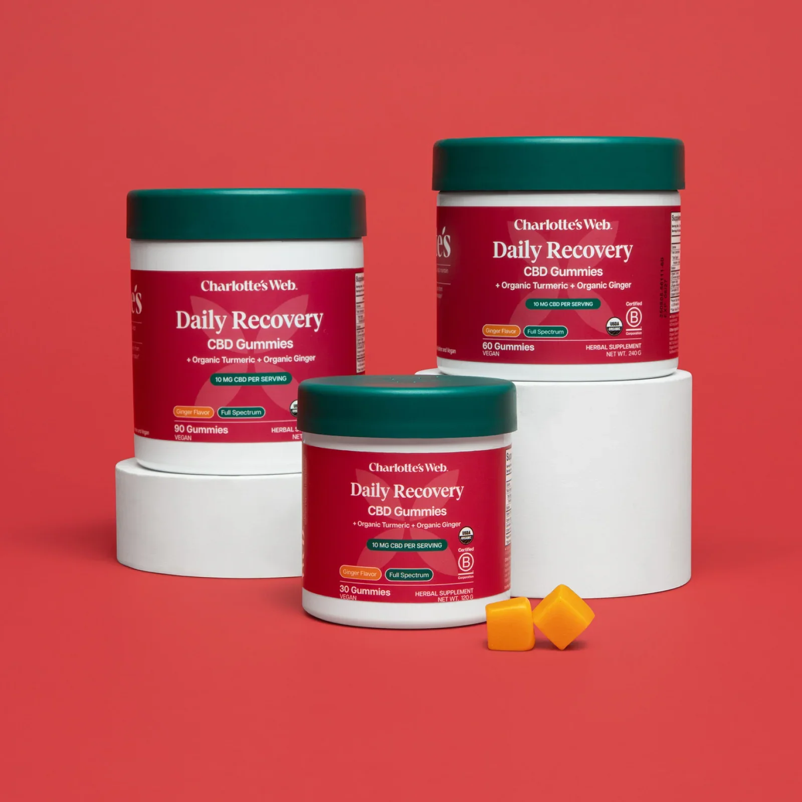
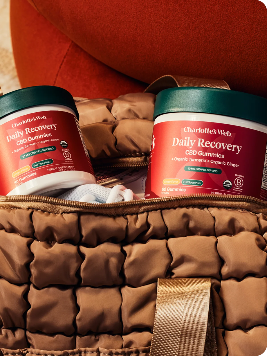
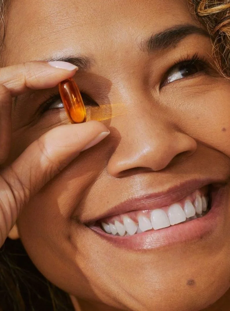
We worked with the Charlotte’s Web team to develop and refine a packaging system that can flex easily across ingestible oils, capsules, boxes, and topicals. The core line, renamed “Daily Care,” is a suite of CBD products offered in several flavors and two potency levels. Potency is indicated by color: a colored flavor pill shows the flavor, and a green color wash denotes potency level.